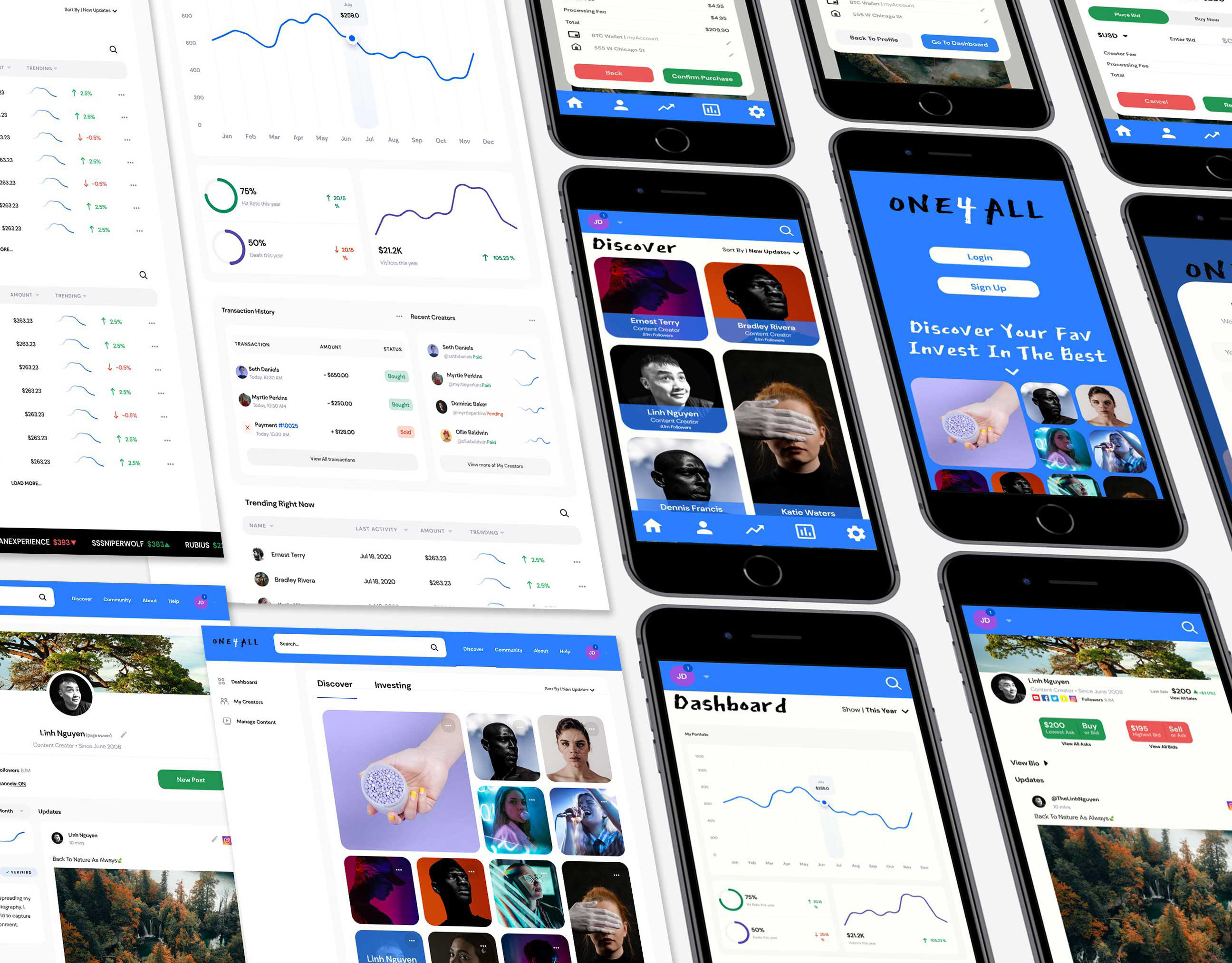
The Burner
Designing an Entire Obstacle Course to Support the Local Children's Hospital
The Burner was an obstacle course mud run that took place in Hubbard, Ohio that was started as a community/regional event to support Akron Children’s Hospital. I was one of the main coordinators and the lead UX and Graphic designer for the majority of that time. When I first joined the team all we had was an logo made by a founder and access to a local motocross/off-road facility where we would host the event. 
There’s a lot more to talk about here than a standard case study would spare time for, but while planning this out I’ve realized that this event has 3 eras that I want to talk about. The research and design work I created cover both the digital experience as well as the physical event
(Fun Fact: This cover image was our amazing charity rep at the children's hospital.)
Project Role
Event Coordinator
UX Designer
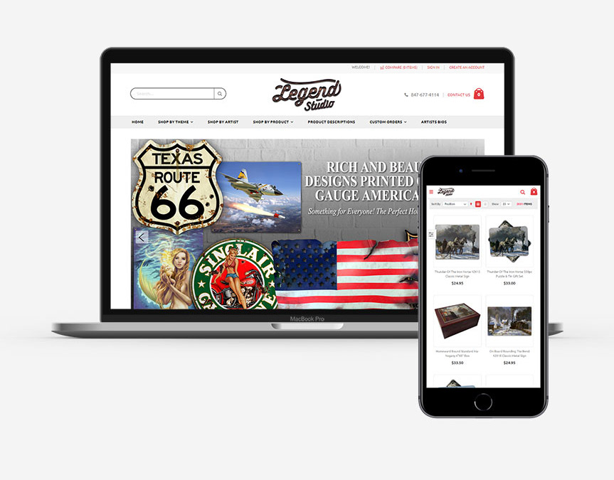
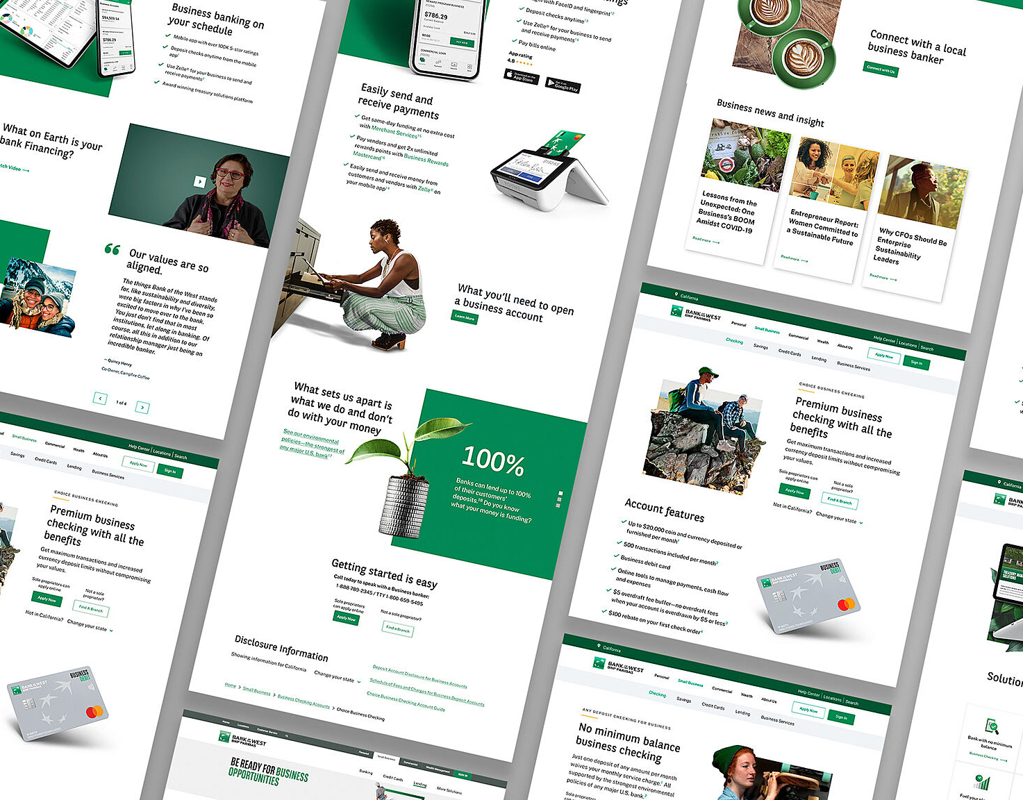
Graphic/Web Designer
Community Manager
Project Scope
Four Events held across three years

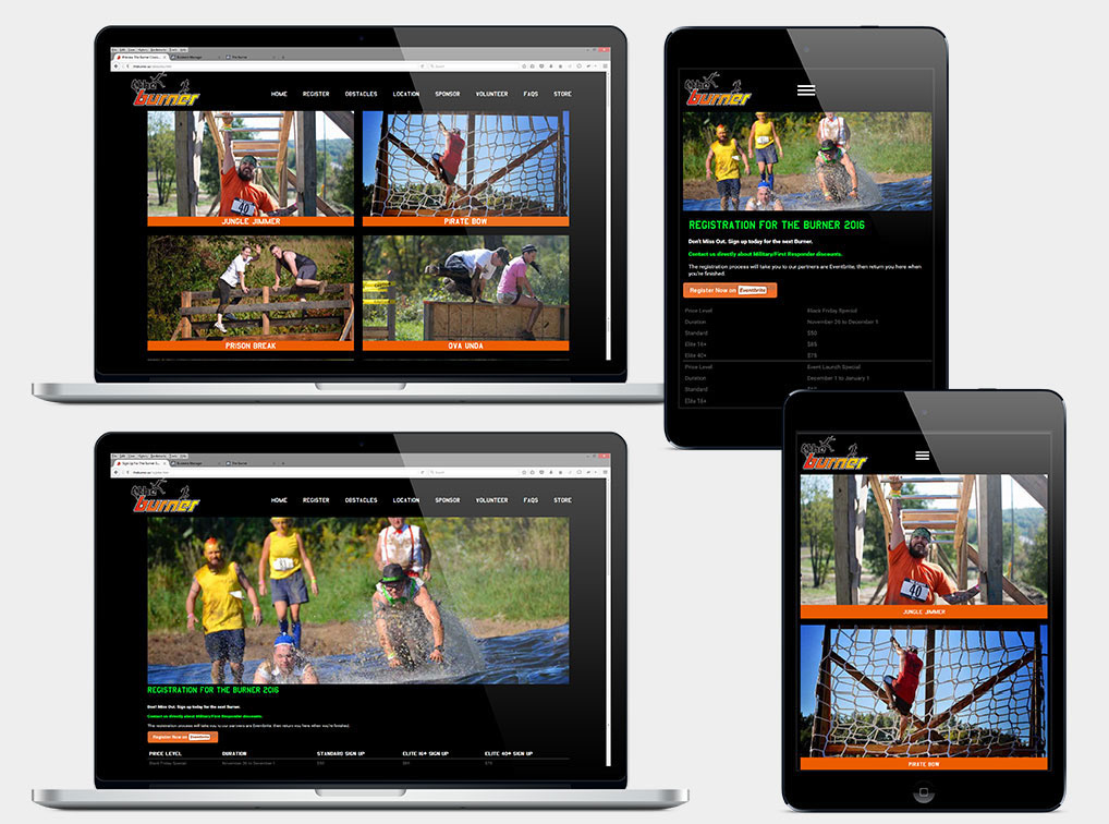
The Burner website in Year 3 of the event - Bringing registration to the Eventbrite platform in the third year allowed for fully integrating that function into our website, improving the experience of our participants and addressed responsive web concerns I'd had with the previous registration platform. 

Year 1
Research
During this first year our team was building up an event into the bubble of Obstacle Course Racing (OCR) popularity. Two of the main forces in that space were Tough Mudder and Warrior Dash. The former had made a name as the long, grueling, and well, tough option, while the latter embraced the fun party atmosphere of the activity. But beyond those two companies, there was an endless variety of other races across those axes at all scales from local charity events to nationwide traveling shows. Many of these runs would combine an additional theme to stand out, from traditional military style obstacle courses to more fun concepts such as ninja or zombie chases. 
Competitive Analysis Guiding Event Design
I was responsible for researching as many of these other runs as we could find. This research was actually serving several purposes. Our team was building this event from the ground up. I was working with two coordinators that each had competition experience in these runs and my research with them helped guide course design, highlighted different “universal” obstacle ideas that would be a must have, and introduced us to new obstacle ideas to help mix up expectations with successive events. 
Building the Beginnings of a Brand
At the same time I was also doing this research on the design and marketing side of building the event. We had no brand at the start. The obvious first thing that came from my research is that all of these events sell themselves on imagery. Every site was pictures of people drenched in mud, laughing with friends, struggling and working together to beat these obstacles. Most sites had hype videos that supercut all the fun and harrowing adventure you’d be having. We had none of that. So I had to figure out what to do about it. 
Two men covered in mud helping a third person scale a wall obstacle with the text "stronger with friends" and the Burner logo

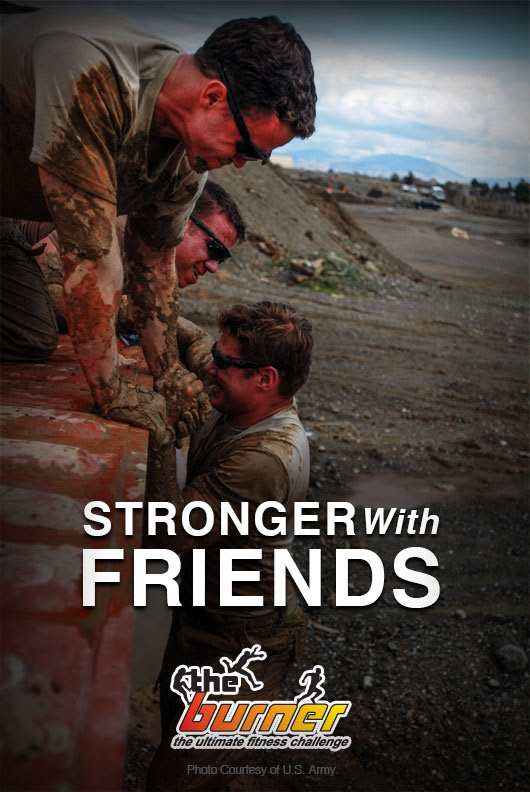
Graphic made using public domain photograph of military obstacle course.

Using the Public Domain
Images published by the US military are public domain as works of the federal government. That gave me a place to start. By pulling from a small selection of obstacle course photos they had made available, I created graphics and banners for the website and social pages I was building.
Two women crawl through mud obstacle wearing Wonder Women costumes with the text "Be Fun. Be Brave. Be a Hero" for The Burner

Graphic made using public domain photographs from military obstacle courses

Using Illustration
To supplement this small selection of images, I created several illustrated runners in the middle of tackling obstacles, along with a selection of illustrated “technical” diagrams for obstacles offering tips in a way to inject the humor of the team into the materials. 
Handdrawn sketch of a male figure climbing across monkey bars with a banner for The Burner around them

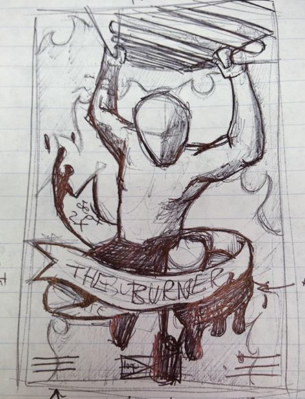
Illustrated sketch for Burner poster and promotional graphics.

Vector drawing of a male figure climbing across monkey bars with a banner that says The Burner September 28th 2013

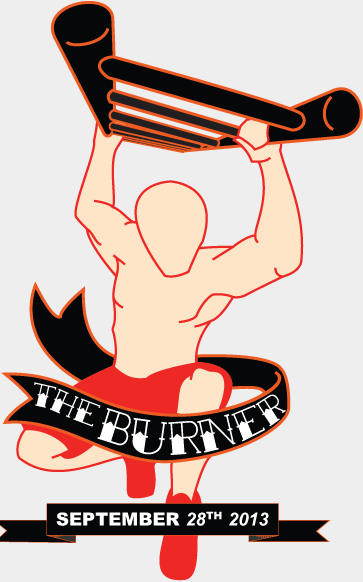
Vector Illustration for Burner promotional graphics.

Learning to Write Waivers
My competitive research also brought our team access to the wide range of documentation used by these types of events. 
There are a lot of forms. Liability and safety are major concerns with any event of this nature and all of this research went into helping the legal and insurance teams of the business craft the proper language, before returning to me to layout the full range of waiver forms and write out technical information and FAQ answers for the website. 
Illustration of a log obstacle with a diagram for traversing it.

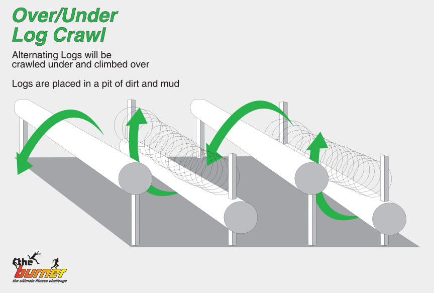
Illustrated diagram of a mud pit log obstacle. One of several Year 1 graphics made to introduce people to The Burner. 

Race Results
The first year ended with the inaugural race. It got the community’s attention. $2000 was raised for the children’s hospital in that afternoon by participants, with additional donations from sponsors and other community orgs present at the event. The first year was a  success. 
And we remembered to take a lot of pictures.
Chart of ticket sales for The Burner 2013

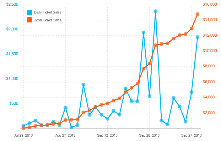
In its first year, The Burner earned $15000 from registered participants, with 50% of profits going to supporting Akron Children's Hospital.

YEAR 2
Strategy
The second year of The Burner was strange in a lot of ways. Our team had already one success and was hyper focused on growing from there. Unfortunately I previously mentioned a bubble for this industry because this is the year it burst. During our research phase for Y2 a popular regional firefighter themed race declared bankruptcy and left hundreds of people having paid for an event that wasn’t happening. This was a well established event and one that was a part of my competitive analysis since the start. It sent the industry scrambling. I was a strong advocate that our legal language needed to protect customers in the case of a similar situation and I’m still very thankful that our entire team agreed. After all, our goal in all of this was helping an organization that protected our community. We should do the same as best as we could. 
This was also the year that a high number of injuries at major race events caused a very sudden cost increase or coverage drops from insurance companies. Several other race events cancelled that year and even the major companies that hosted traveling events shortened their schedules. This trend continued into my 3rd year with the organization.
Surveying the Community
Specific to our team, I came into this second year with an amazing array of research information. With an event under us, I was able to survey participants and community members about all aspects of the event itself along with marketing and community building focuses. Following these surveys I created scripts and moderated interviews with members of the community and the primary event founder. This led to improvements in the second year such as developing a split track 3 mile and 7 mile course to give participants more choice in how they wanted to run the event.
survey results for the question "how clean was the endurance event"

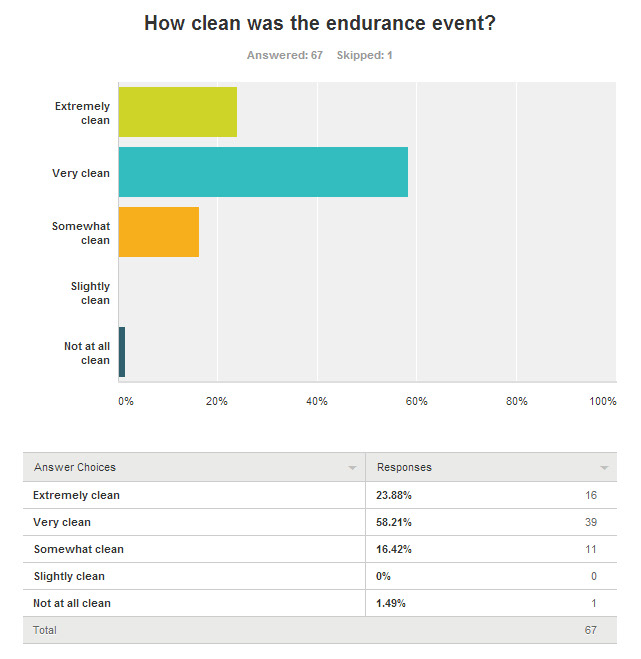
The subject of cleanliness was, in retrospect a very bad survey question for a mud run to ask.

Survey results graph of the question "overall, how would you rate the endurance event?"

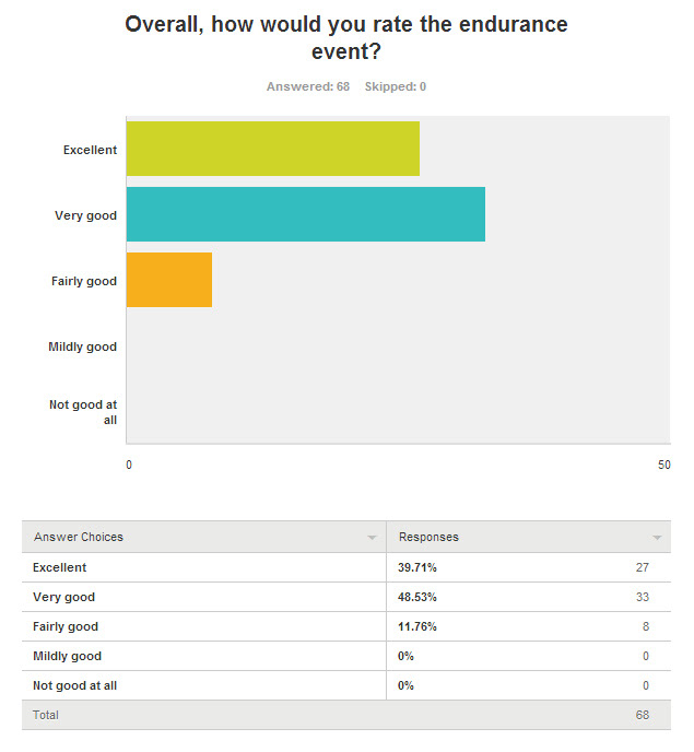
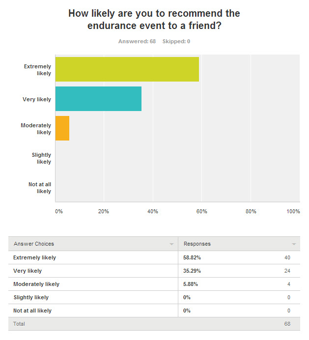
Post event survey responses were broadly impressed with event. This survey was used to interview several respondents on specific areas of improvement moving from year 1 to 2.

Survey results graph of the question "how likely are you to recommend the endurance event to a friend"

Looking forward to Year 2 The entire Burner team was looking at returning participants bringing friends and family to join in the experience.

The Year We Started Having Photographs
This year we had a lot more visuals to play with. I dove into a full website redesign with these visuals as the central focus. The website from the first year had been little more than a news and registration page I designed and coded on a very tight deadline. 
My focus on the new version was to highlight our own community members in all of the images used on the website and all of the marketing materials from posters to digital and social advertising. 
It was my goal that anything we produced and put out into the world was reflecting our passionate and growing community. 
Double-sided handout flyer. Front shows a man and woman climbing over the top of a wooden wall covered in mud. The other side shows several images of mud run participants and contains date and sign up information for The Burner.

This double-sided card was the first advertisement for The Burner I designed that used images of our own participants running the course. Imagery like this formed the backbone of all of my design work moving forward.

Multiple images of Burner website pages and the initial concept. Each screen focuses on images of the event.

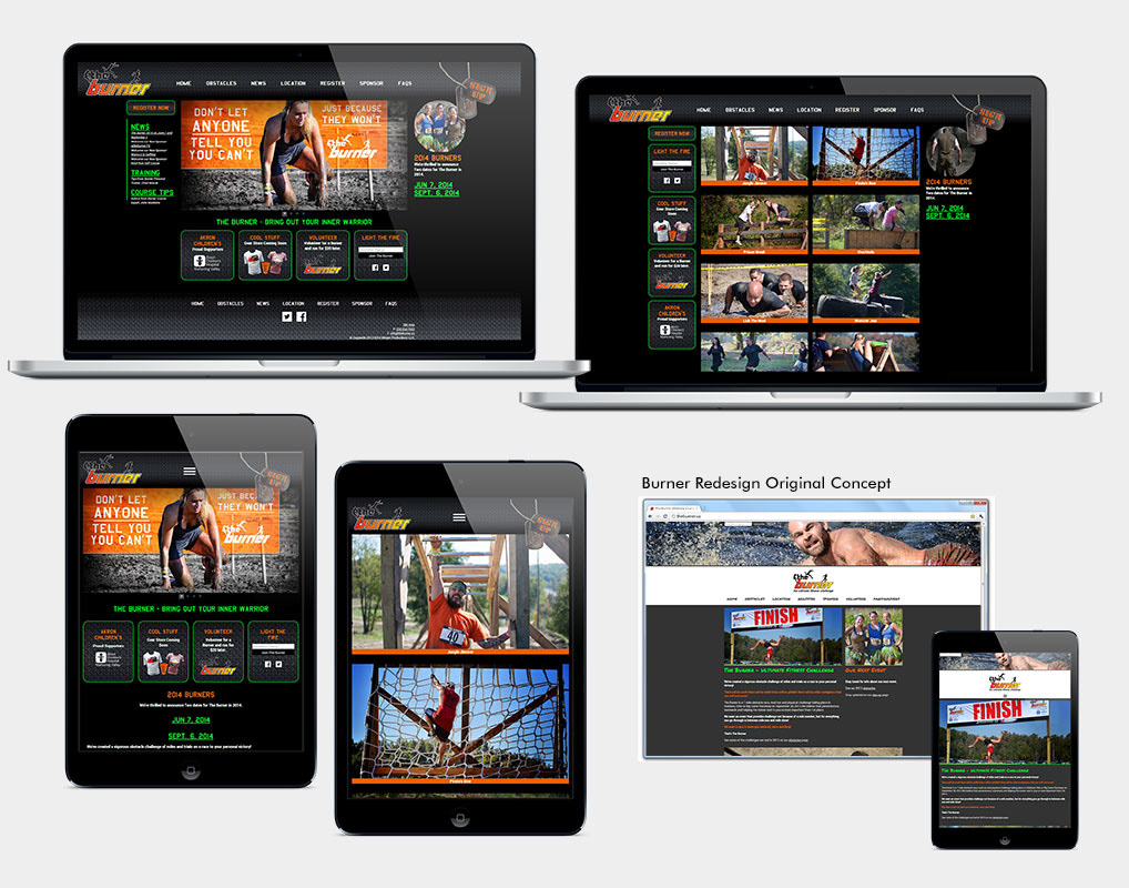
The 2015 website was informed by the web strategies of our major competitors and my own goal of showcasing our community of participants. This redesign also created a responsive experience on the website.

A mud covered woman passes over the top of a large wall obstacle. Text says "Toughest 7 miles in Ohio" with The Burner logo

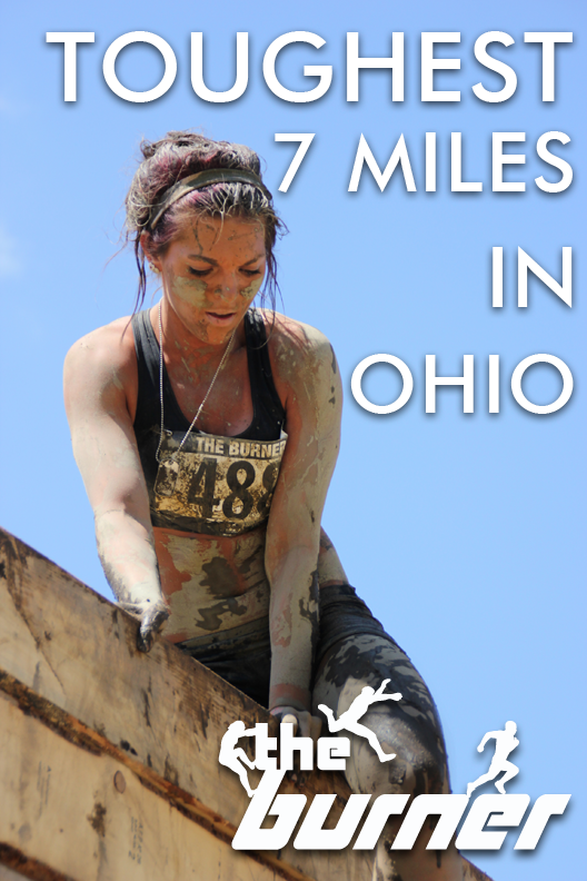
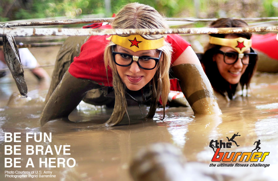
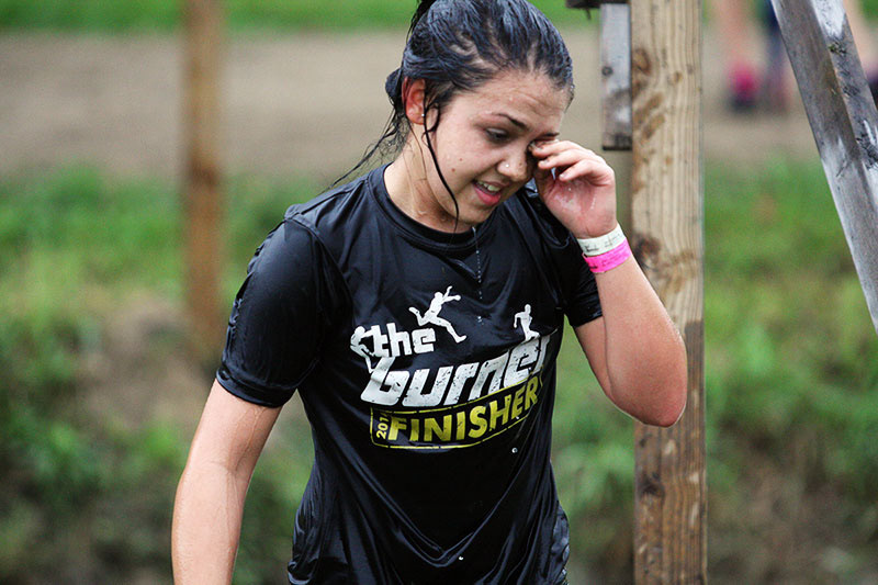
Beyond major advertising, I used powerful images from our event to create social media content for The Burner

Regrouping at the End of the Season
Truthfully, The second year was scary. We were trying to build something while watching some of the events in our space struggle and close. The business team was courted by an event registration platform that promised more support than they were able to provide. Limitations with that platform complicated integrating registration into our website and that served as a central argument from me towards moving to the Eventbrite platform moving into the third year. In the end though, the events this year were a success and this time raised $4000 for the hospital. The event coordination team moved into its third year focused more on refinement than growth now.
YEAR 3
Iteration
By the third year of The Burner, the financial and liability issues in the industry were much more noticeable. Major companies were announcing shortened seasons. The middle sized event companies seemed to be feeling the pressure the worst, with many previously reliable races from my competitive research running their final events this year. As a smaller event in the charity space, The Burner felt less affected than others. I attribute that largely to how self sufficient the event was from the start.
If community was a goal in the second year, then I’d describe it as my driving force in the third year. I built upon previous survey and interview processes to advocate bringing in an additional coordinator from our always growing community. We built a group of people invested in helping find areas of improvement in all aspects of the event and marketing. 
Two images of tents and information booths for the Burner team to set up at marketing events

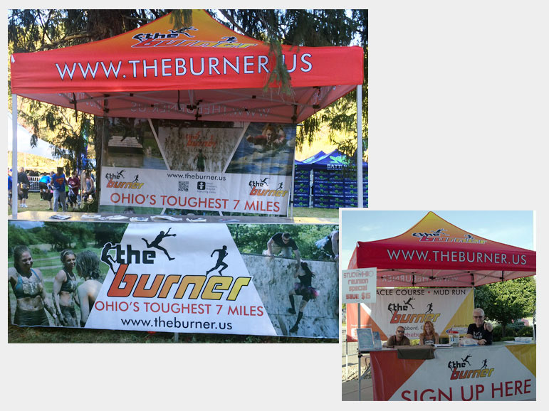
Images from events weren't only good for our digital marketing. Burner team members also took them to many regional events to spread the word. (Inset) Burner Team members running a booth during Year 1.

Updating and Improving the Look
With the change in event registration platform to Eventbrite that I advocated for, I was finally able to realize a long term goal of making our entire online experience mobile friendly to better match how our users were using the website. The platform change also gave team members a powerful app based registration and check in tool that brought massive improvements to marketing at other events and signing runners in on race day. 
In the design department, I had spent two years iterating on style guidelines to connect the pre-existing logo to how the overall brand and voice of The Burner had grown since being founded. By this point we had three events worth of wonderful and fun images to pull from for any graphics use I needed. 
Multiple images of The Burner website home page updated to highlight new video content

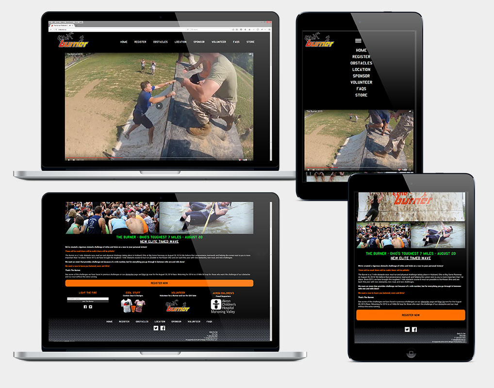
A new website iteration focused on video content for an updated homepage experience

One Last Race
My final event working with The Burner represented another successful growth, with this event bringing in $6000 for the children’s hospital from participants. This matched what we’d raised from all of the previous events combined. We had built a vocal and passionate community of people that had fallen in love with mud runs through our annual races. The community had become our strongest advocate and word of mouth was easily the most important factor in new participants joining us, based on answers to my user surveys from this final event.
Though I left the team independently at the end of the event this year, I sadly later found out that The Burner would not be returning for a fourth year.
Honestly my entire time working with The Burner was unexpected. But I immediately fell in love with working in and for our dedicated community. That aspect of research and design based around being immersed in the community I’m designing for is something I have taken from this project and apply to every user experience and design opportunity that I am lucky enough to be involved with. 
Flyer for The Burner 2016, showing the date, logo, Mud Sweat Obstacles tag line and featuring an image of a runner doing a cannonball into the pool at the end of a course slip'n'slide

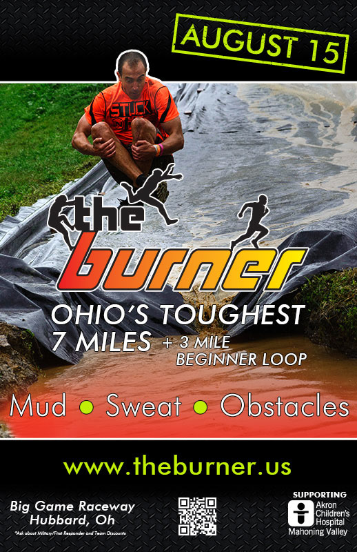
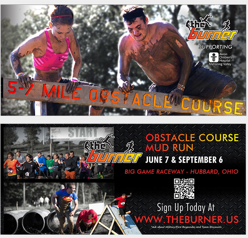
Year 3 event flyer created with updated design system and branding guidelines.

Thanks for making it to the end.

That means you get a finisher shirt.
Woman covered in water wearing The Burner finisher shirt earned in a previous event.

Looking Slick.

You may also like

Back to Top