Redesigning a Global Bank to hold onto their local community & roots
Project Role
User Interface Designer
Visual Designer
Design & User Experience Strategist
Visual Designer
Design & User Experience Strategist
Project Scope
Six months of design for agency with a large-scale banking website client, and directly responsible for Business Checking and About Us/Policy sections of the website. Involved in image curation, editing, and visual design to meet brand voice guidelines sitewide. Strategic consultant and UI designer for site layout design and component use and creation within the brand design system. Coordinated with designers in other areas to maintain UI and design system unity across all website sections.
Awards
Building a Brand Voice for Supporting local businesses that "break out of the box"
Bank of the West entered this redesign project with a focus on their stance and desire to be a leader among the sustainable banking movement. This provided a clear direction for voice and tone. Working on the small business sections of the site gave me the opportunity to directly guide and build up that voice. This process started with image curation where I strove to find diverse imagery that represented a wide range of small business interests ranging from individuals to independent enterprise. Working beyond the basic images, I worked to develop a cutout style treatment where the final form of images would be seen cut "out of the box" to represent their new way of thinking. This format was used to break up square "corporate" feeling images and create a sense of natural connection.
Building graphics that show customers the real tech and the real impact of the bank
I created a wide range of graphics and digital mockups to represent technology options available to customers and business owners. I also developed graphics based on annual report information to include in informational company mission pages.
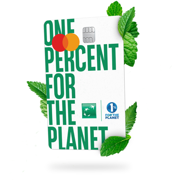
Card option with rewards that give back to environmental causes
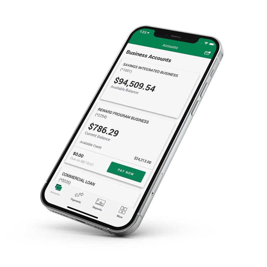
mockup of a business account app
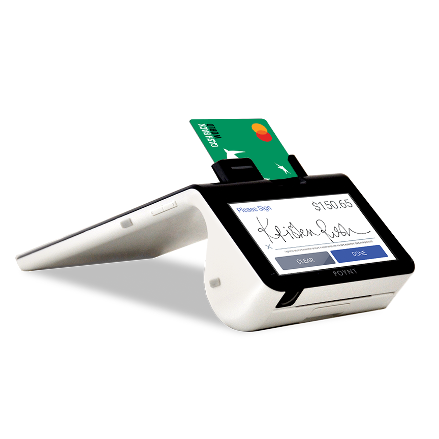
mockup of business checkout devices and hardware
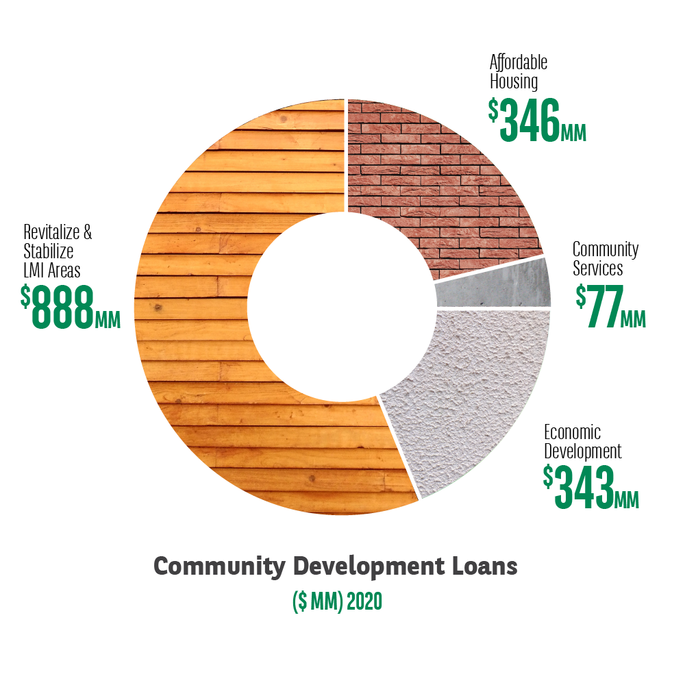
graphic chart showing where the bank invests community resources.
Pairing partner graphics to their impact areas and showing where your bank invests your money for good
Part of the Bank of the West mission involved partnership with organizations across the wide range of environmental causes they championed. In creating these graphics, I researched each partner org and developed treatments for highlighting them in a unified style either as hero images or badges used across the site.
Alvéole: Urban Beekeeping
The Conservation Alliance: background natural cave formations
1% For the Planet: Business giving with an environmental focus
Protect Our Winters: Outdoor recreation conservation
Expanding the Design System while building lo-fi pages
The low fidelity concepts primarily explored how to best show information heavy pages without overwhelming visitors. I displayed concepts using existing component structures and patterns and also developed multiple new patterns and design system components to serve specific information needs. I was later tasked with fully developing the new components to be documented in the Bank of the West design system.
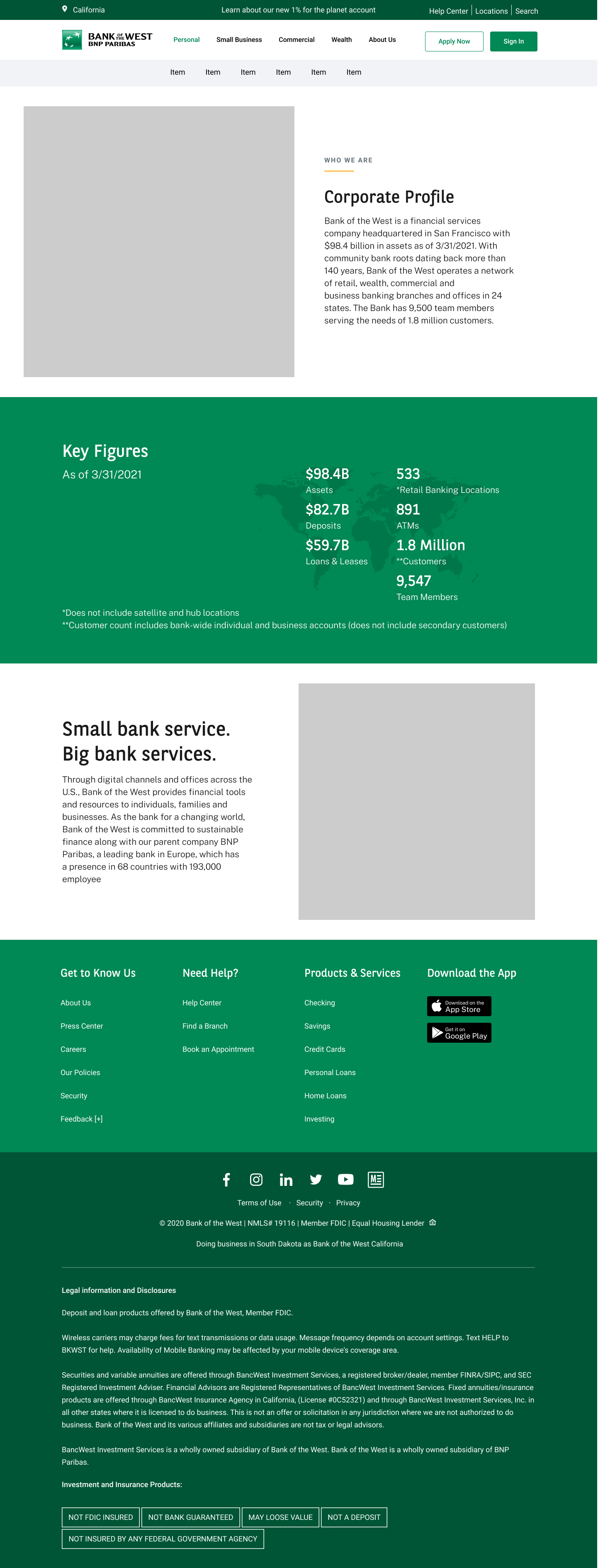
Lo-Fi Company Overview
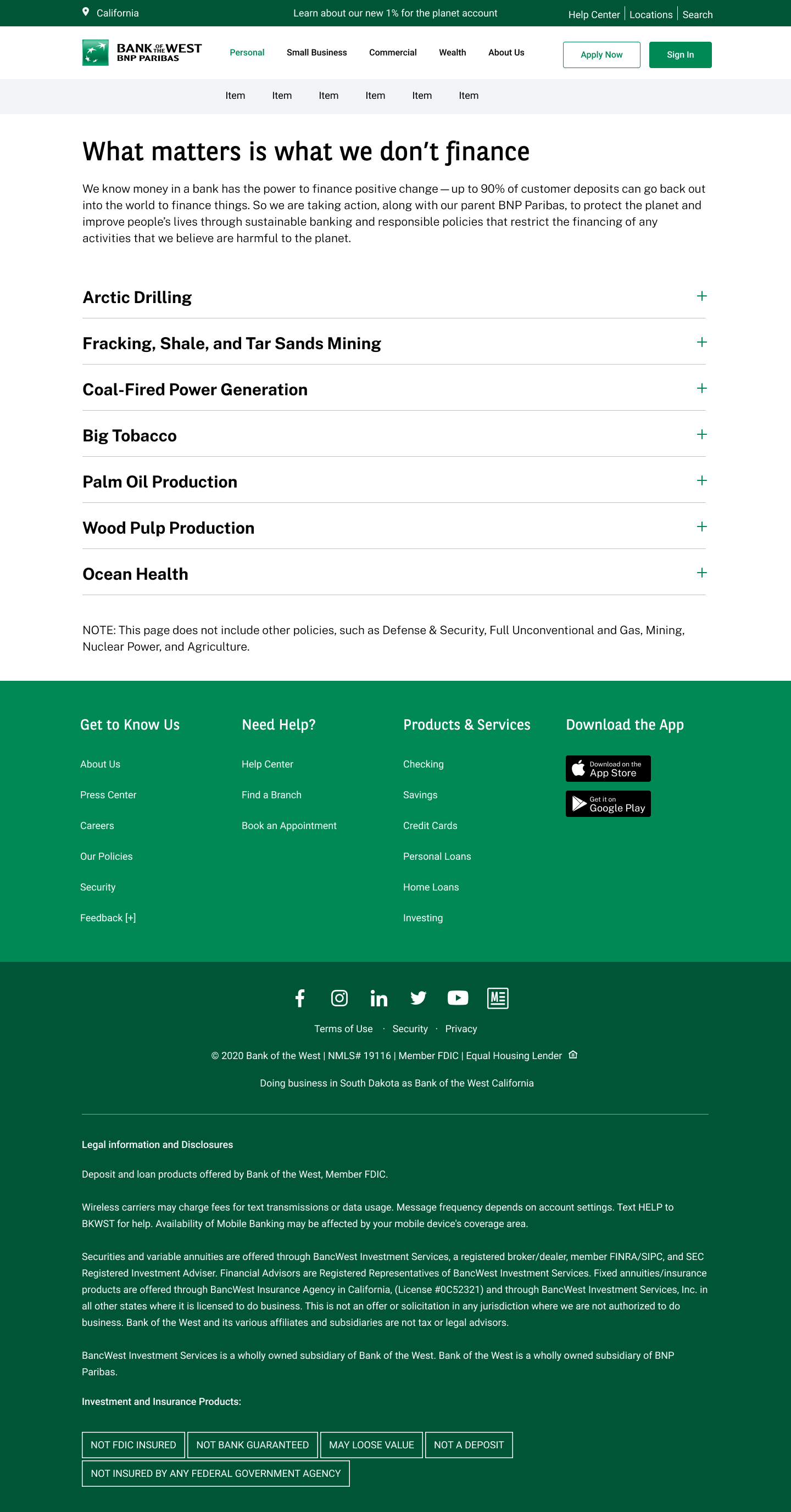
Lo-Fi Policies Concept
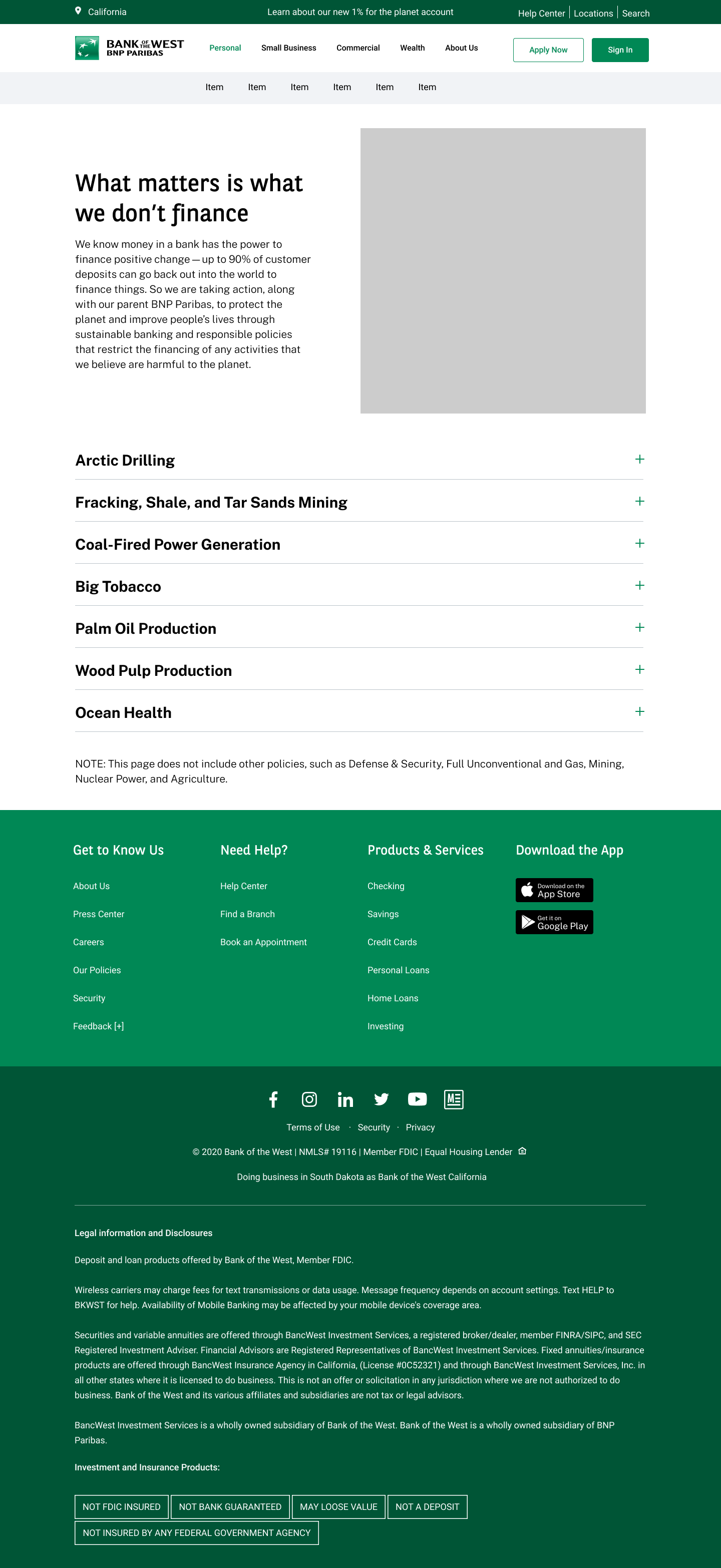
Lo-Fi Expanded Policies
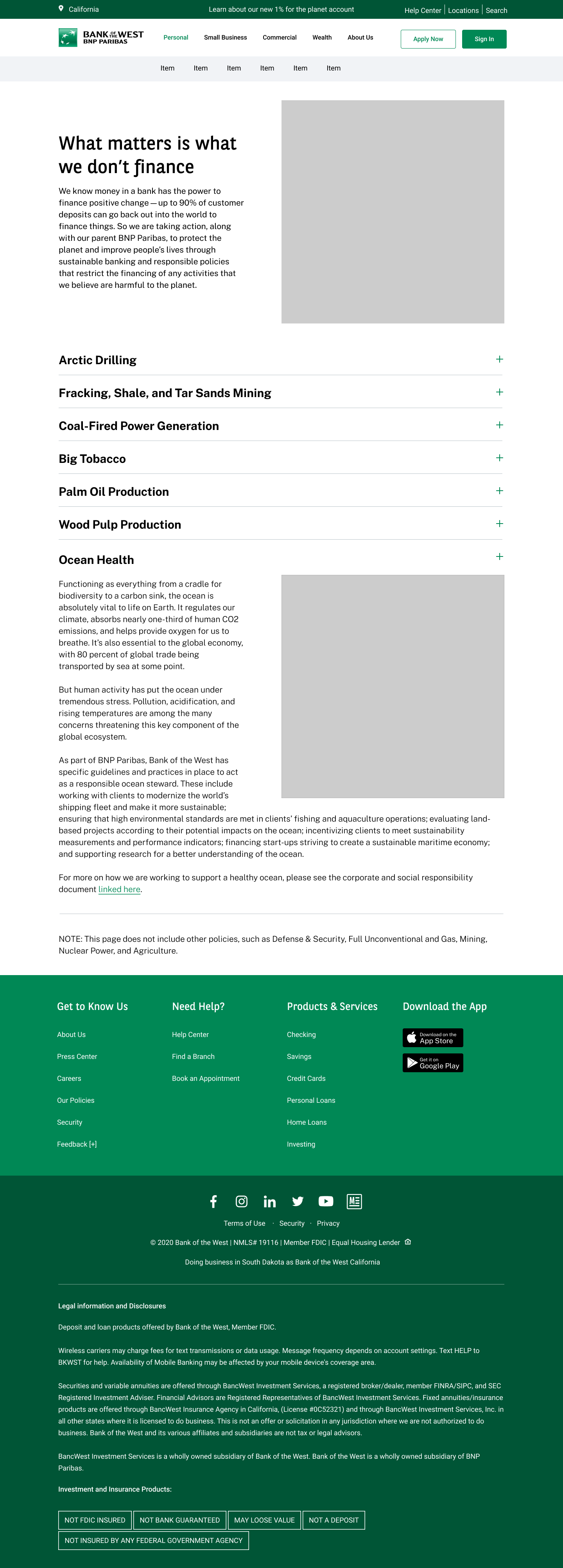
Lo-Fi Nested Policies

Lo-Fi Community Impact

Lo-Fi DEI
Bringing the Voice & character to design concepts
In the hi-fidelity stage I began to incorporate images and graphics into the concepts, while collaborating with the bank team on discussing voice and specific image choices. I was also implementing new patterns for cards, tables, other specialized components I worked on such as a horizontal accordion window. Following image conversations and approval I would create the cutout treatment used in the final website.
Business Checking Section
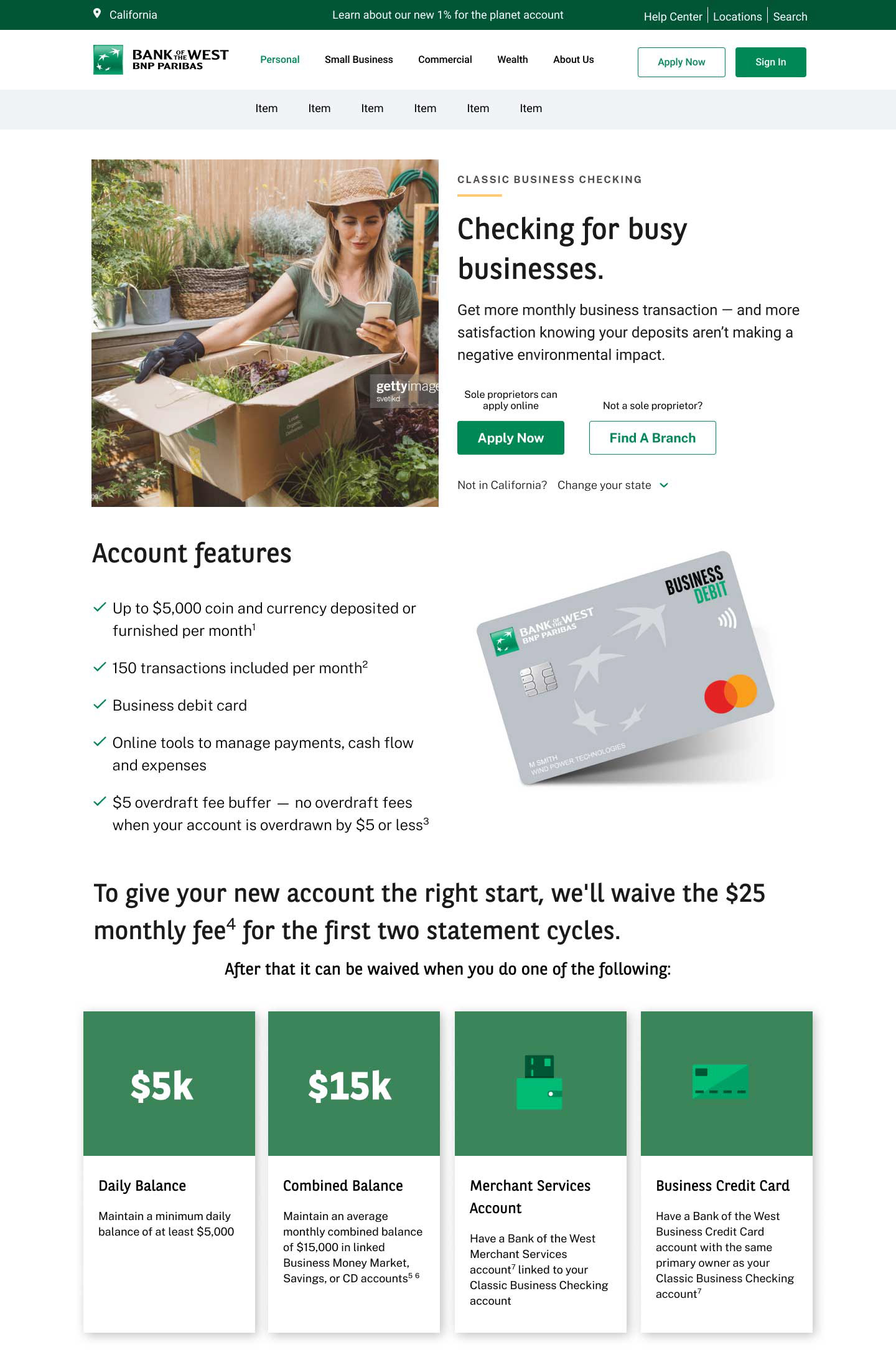
Striking a balance between friendly character and important information
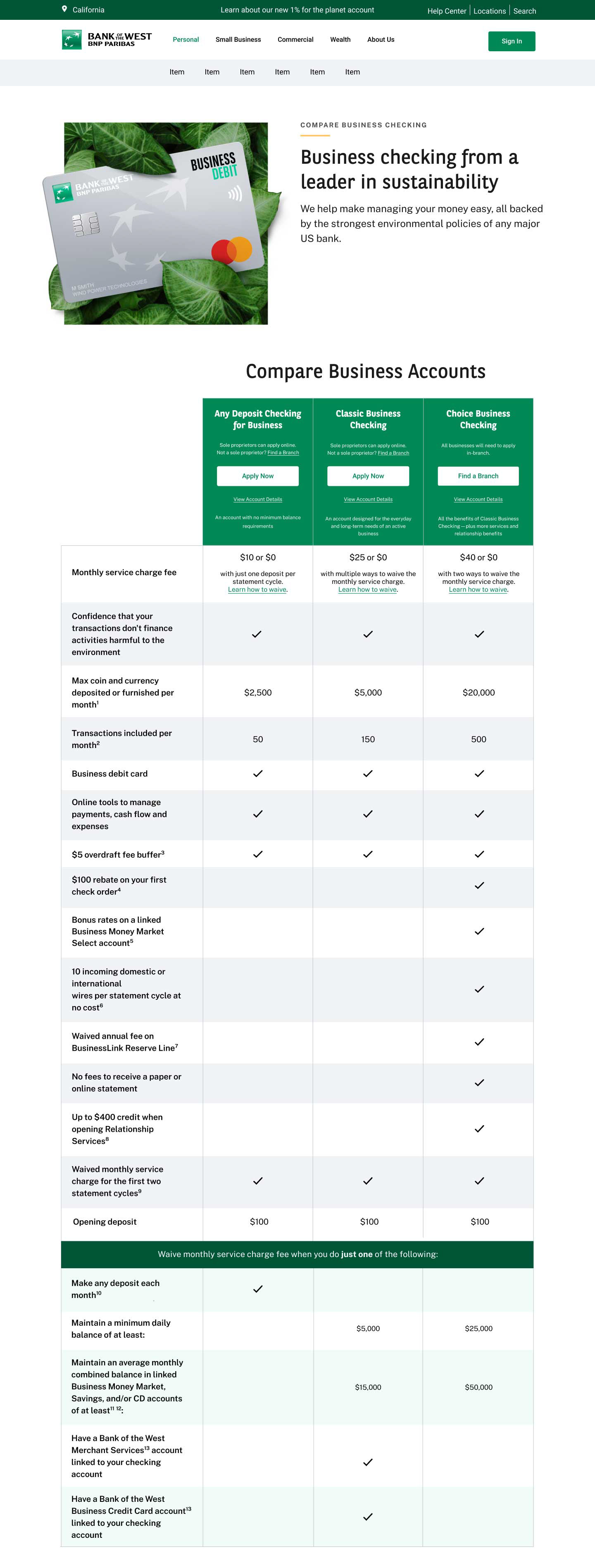
Organizing important information for readability
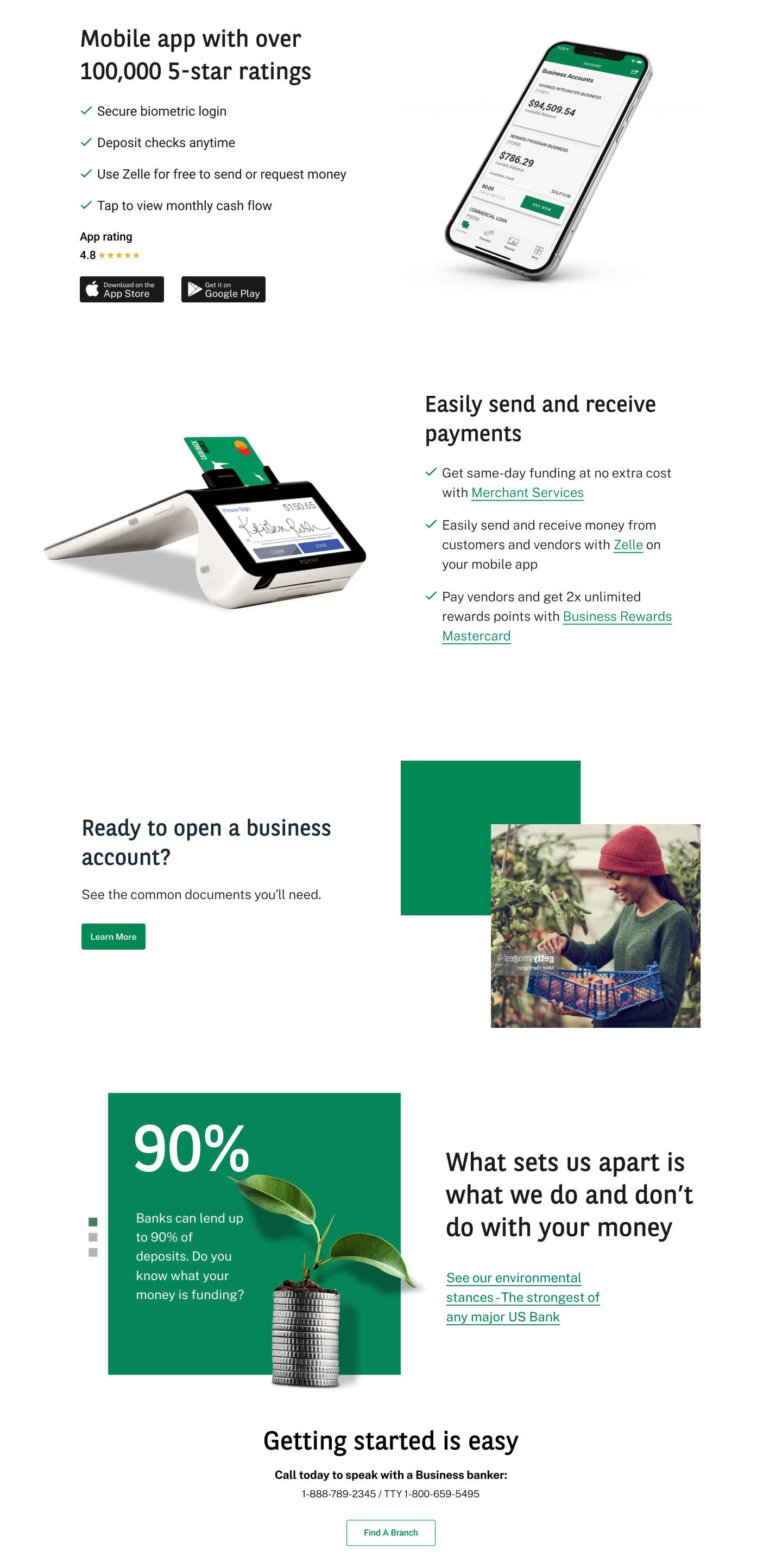
Reusable Modules show throughout the site
Why Us Section

Using infographics with the words of the president to highlight Community Impact

Graphic visualizations of impact paired with new Design components deliver important initiative information
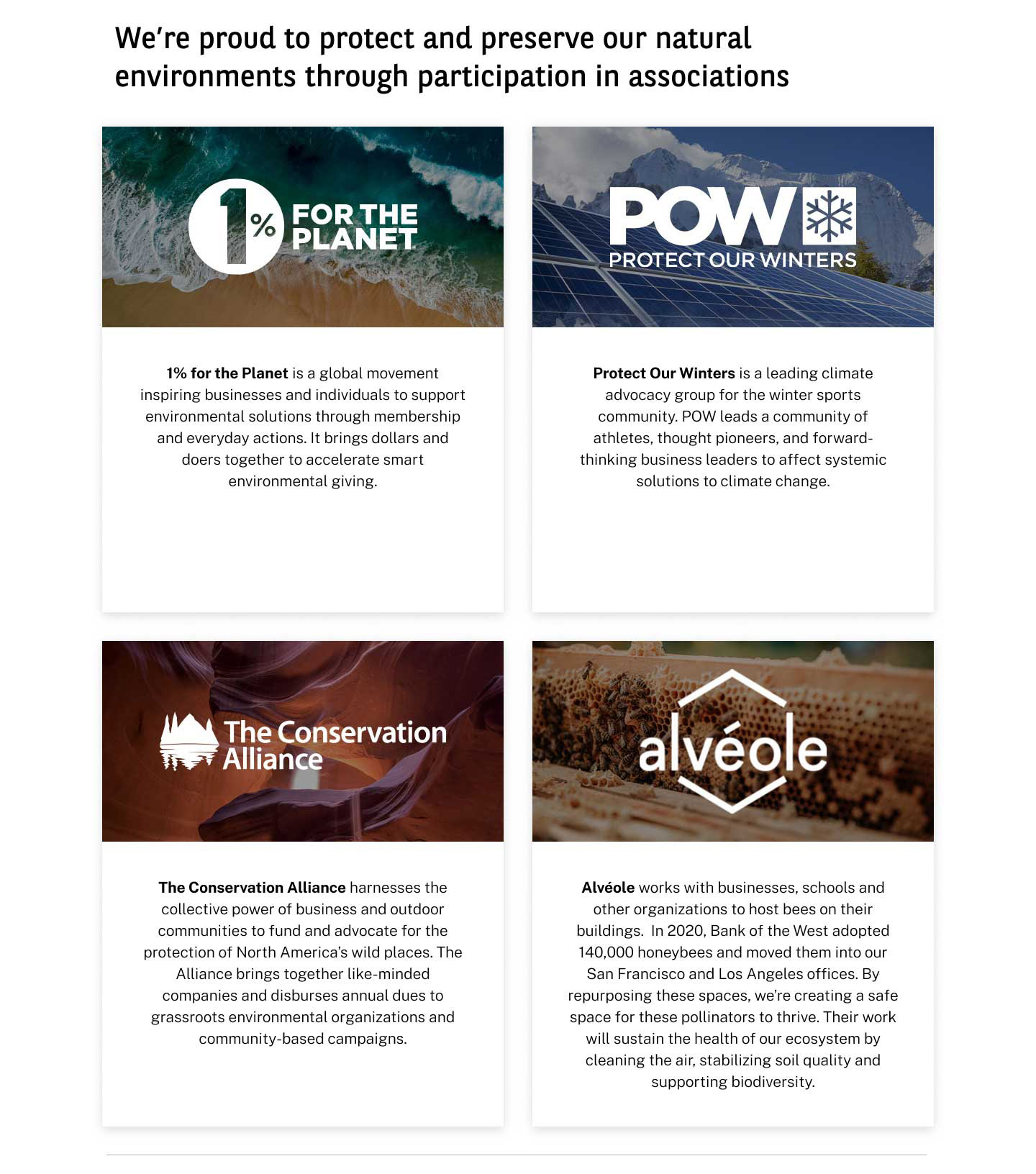
Partner graphics drive to important bank initiatives
Final designs for a fundamentally different bank
